Zave Inc.
A mobile savings platform that transforms financial goals into achievable milestones through brand partnerships, flexible saving plans, and interest-free credit.

Details
Role
UX Researcher & Designer
Timeline
~ 4 months
Skills
User Research, Behavioral Analysis, User Segmentation, Information Architecture, Interaction Design, Visual Design, Prototyping
Team
Amruta Kulkarni, Tariq Aziz
Overview
Zave is a mobile fintech platform designed for Gen-Z users (ages 18-27) struggling to save for future purchases. Through research with young savers across India's Tier 1 cities, I discovered the real barrier wasn't knowledge or income. It was motivation, flexibility, and trust. The platform combines brand partnerships offering 7-12% cashback with flexible monthly saving plans and optional interest-free credit earned through consistent behavior, transforming financial planning from an intimidating chore into an achievable, rewarding journey.
Take me to the
Main Stuff
↑
Too Long, Didn't Read: A Very Brief Summary

The Problem
Traditional fintech apps focus on rigid structure and discipline, completely missing the emotional roots of Gen-Z's saving struggles.
Gen-Z faces a paradox: they're digitally savvy and know they should save, but impulsive spending and failed savings attempts remain persistent. Through interviews with users aged 20-28, a clear pattern emerged. The barrier isn't lack of knowledge. It's emotional. Fear of commitment, anxiety about restrictive budgets, distrust of credit, and lack of immediate gratification create a cycle where saving feels like punishment rather than progress.
The Solution
A brand-partnership savings platform that turns long-term goals into achievable milestones with tangible rewards at every step.
Instead of abstract budgets, users create savings goals for specific products from brands they love (Apple, H&M, MakeMyTrip, Nike). Instead of waiting months to see benefits, they earn 10% cashback on every deposit. Instead of feeling locked in, they can withdraw, switch brands, or modify goals anytime. A gamified streak system rewards consistency by unlocking access to interest-free credit, letting users combine savings with credit to reach goals faster without paying interest.
A user saving ₹1,00,000 for an iPhone over 10 months pays only ₹90,000 thanks to cashback. If they maintain their streak, they can access credit to complete the purchase in month 6 instead of waiting until month 10.
Research
Market Research
Analyzing the competition to find what's missing.
I studied leading fintech platforms including Fi (Neo-Bank), CRED (Bill Payment), Simpl (Buy-now-pay-later), Klarna, and IndMoney. Successful platforms shared traits: clean visuals, satisfying interactions, and reward systems. But most focused on single use cases and required high effort to maintain. CRED made bill payments rewarding but didn't help with saving. Simpl offered convenience with interest charges. Klarna's policy changes eliminating interest-free credit showed how quickly user trust evaporates.
Key insights emerged:
→ Simplicity matters more than features
→ Rewards must feel immediate and tangible
→ Flexibility is non-negotiable for Gen-Z
→ Existing apps treat saving and credit as separate problems
User Interviews
Discovering an emotion-management problem disguised as a time-management one.
Savings Management
Users encounter difficulties in managing their savings effectively.
They frequently dip into savings for unrelated expenses.
Users seek tools for segregating and preserving savings until they reach their goals.
Saving Models
Acknowledge the significance of saving but lack a structured strategy.
Want flexible, practical approach tailored to their diverse financial situations.
Desire a simple yet effective method for consistent savings without compromising daily expenses.
Purchase Goals
Users find motivation in setting specific purchase goals for savings.
Visualising their desired purchase and remaining savings targets enhances their commitment to financial objectives.
Expensive Purchases
Users aspire to acquire high-end items like gadgets, designer fashion, and luxury experiences.
Challenges in effective planning often lead to impulsive decision-making.
These impulsive choices frequently result in buyer's remorse post-purchase.
Purchases Saving & Planning
Want to seek a specialised saving and planning tool for expensive purchases.
Key requirements include setting clear financial goals and tracking progress.
Customisable saving plans, accounting for income, expenses, and timelines, are highly desired.
I conducted semi-structured interviews with users aged 20-28 across income levels, from students on allowances to professionals earning 15 lakhs annually. I focused on their emotional relationship with money rather than budgeting tactics.
The pattern was striking. When discussing expensive purchases (laptops, travel, designer items), users sounded excited and aspirational. When talk shifted to saving for these purchases, the tone became heavy. Words like "guilty," "anxious," "overwhelming," and "stuck" dominated. One freelancer described saving as "disappointing because even when I try really hard, the progress feels so slow that I just give up."
Affinity Mapping
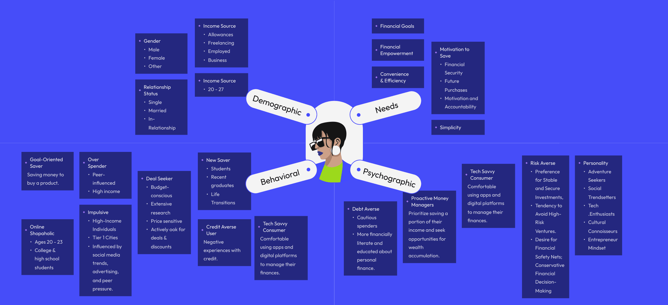
Segmentation
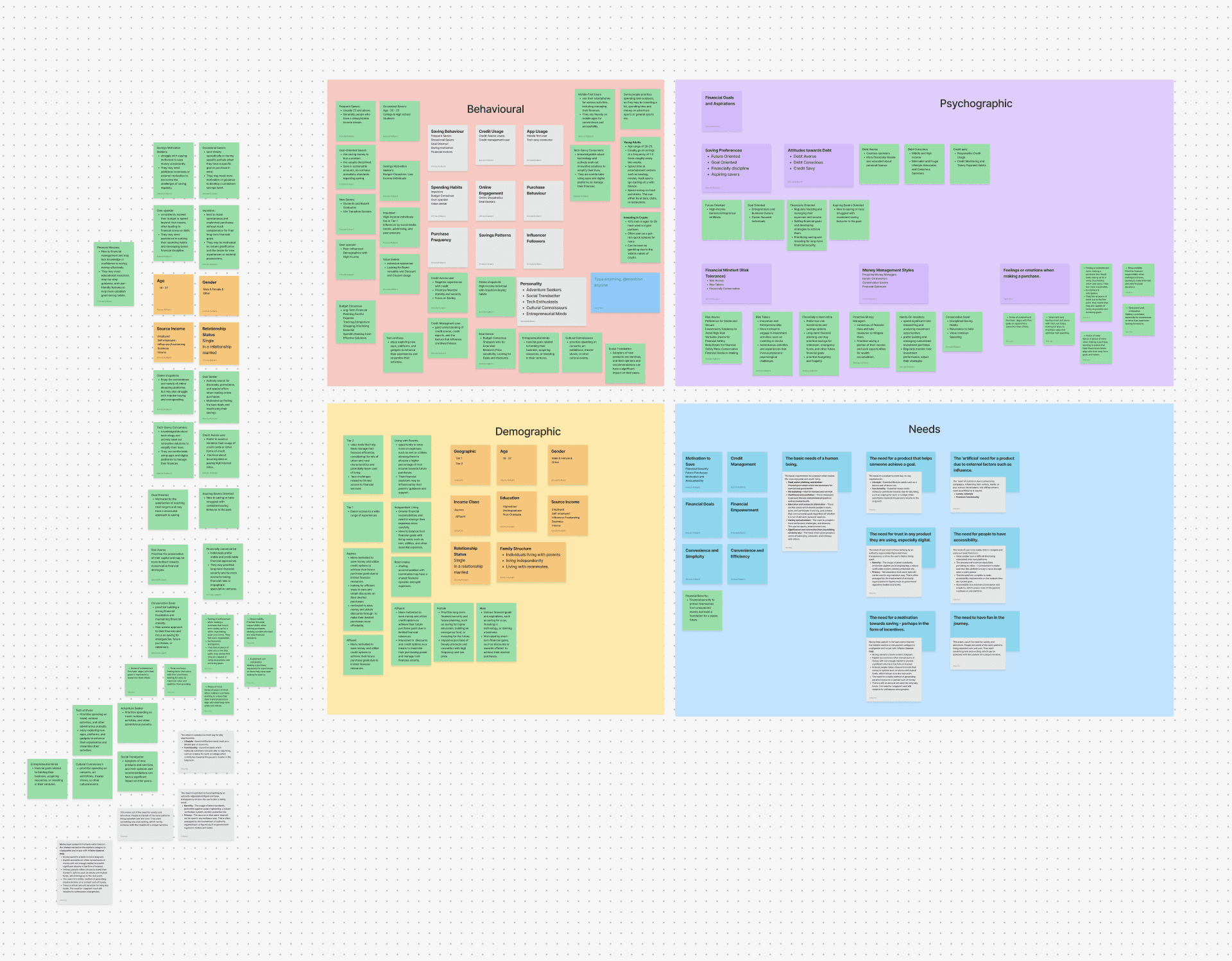
Demographics
Users spanned Tier 1 and 2 cities, ages 18-27, from students to employed professionals. Income ranged from allowances to full-time salaries. Despite diverse backgrounds, they shared remarkably similar behavioral challenges
Behaviors
We identified distinct archetypes. Frequent savers (23+) saved regularly but lacked strategies. Goal-oriented savers were disciplined for specific purchases. Occasional savers (20-23) struggled with consistency. Spending patterns split into impulsive buyers, budget-conscious planners, over-spenders, and value seekers. Credit behavior divided into credit-averse users and credit-management users who understood but feared using credit.
Psychographics
Users were overwhelmingly risk-averse, preferring stable investments. They were tech-savvy, mobile-first, and comfortable with digital platforms. Personalities ranged from adventure seekers to social trendsetters, but all wanted financial safety nets and conservative money decisions.
Needs
Users needed motivation during pessimistic moments, rewards on savings to feel progress, help setting realistic goals, transparency about costs, flexibility to access funds, and financial empowerment through learning. They wanted the journey to feel less like work through gamification and visual satisfaction.
Problem Space
Once the clusters were stable, the core design challenge became clear. The problem had been framed going in as a financial tool problem: users needed better budgeting, better tracking. The research reframed it completely:
Gen-Z doesn't have a time-management problem. They have an emotion-management problem. The barrier to saving is psychological: lack of motivation when progress feels invisible, fear of rigid commitments, anxiety about using credit responsibly, and the complete absence of immediate gratification.
This led to the How Might We statement that governed the rest of the project:
How might we create a savings platform that aligns with Gen-Z's existing habits while encouraging sustainable growth in a way that feels natural, rewarding, and non-intrusive?
Personas
Creating an outline of the potential user-base for Zave.
Two composite personas were built from the segmentation data, applying a goal-directed design approach (Alan Cooper), grounding each persona in what they're actually trying to accomplish, not just who they demographically are.
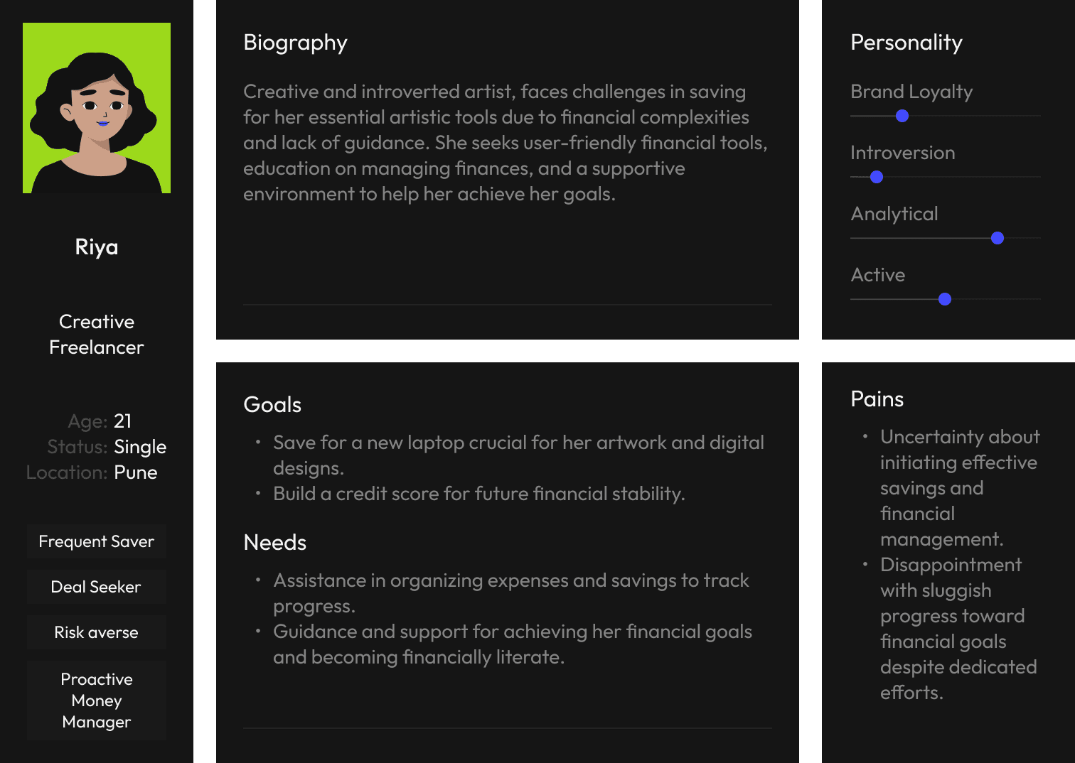
Riya | Age 21 · Creative Freelancer · Pune · ~₹6L/year
Creative and introverted, Riya faces challenges saving for her essential artistic tools due to financial complexity and lack of guidance. She seeks user-friendly financial tools and a supportive environment to help her achieve her goals. Goals: Save for a new laptop crucial for her artwork; build a credit score for future financial stability. Pains: Uncertainty about initiating effective savings; disappointment with sluggish progress despite dedicated efforts.
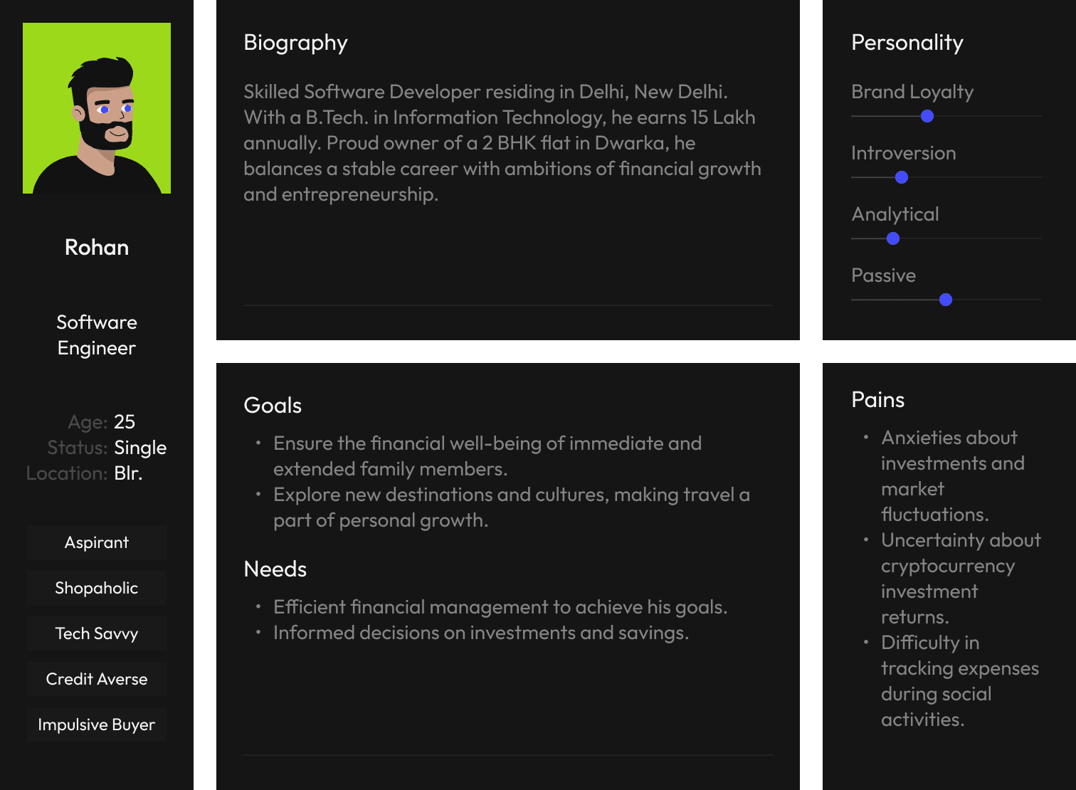
Rohan | Age 25 · Software Engineer · Bangalore · ₹15L/year
A skilled developer with stable income and ambitions of financial growth. He balances a comfortable life with aspirations including travel and family financial wellbeing, but is an impulsive buyer and avoids credit due to anxiety about investment risk and tracking expenses. Goals: Ensure family financial well-being; explore new destinations; make informed investment decisions. Pains: Anxieties about market fluctuations; uncertainty about cryptocurrency; difficulty tracking expenses during social activities.
Some samples


User Stories
Rather than moving straight from personas to features, user stories were written to bridge the two, ensuring design decisions could always be traced back to a real user intent. Six archetypes were identified, each capturing a distinct mode of using the platform:
As a goal-oriented person, I want to reduce the time to achieve purchase goals, so that I can purchase without straining my finances.
As someone who hates taking risks, I want to be able to trust the finance platform, so that I can feel confident that my money is safe.
As an enthusiastic traveller, I want to efficiently plan trips in advance and save money, so that I can pre-book travel at the best possible prices.
As an indecisive shopper, I want to save for future purchases even though I'm unsure what to buy, so that I can build a financial buffer and have flexibility to decide later.
As someone who likes to save, I want my saved money to grow through interest or rewards, so that I can maximize the value of my savings and reach goals faster.
As a deal seeker, I want to see the price trend of the product I'm saving for, so that I can make informed decisions about when to buy.
List
I want to stay motivated enough to save money, even when I'm feeling pessimistic.
I want to earn something on my savings.
I want to reduce my time to achieve my purchases, but without burdening my finances.
I want to be rewarded for achieving my goals, such as earning cashbacks or receiving discounts.
I need help setting realistic financial goals.
I don't want to be restricted to saving a certain amount every month for a purchase.
I need help prioritizing each of my savings goals.
I want to make purchases for goods or services as soon as the price goes down.
I want to have more options from established and trusted brands to choose from when I'm making purchases for products or services.
I want to collaborate on saving.
I don’t want to pay more than I need to for a product or service in the form of interest.
I want to be aware of any additional and hidden costs that may be associated with my goals.
I want to be able to automatically allocate a portion of my income towards savings goals.
I want to be able to visually see my progress towards my savings goals at a quick glance.
I want to be able to visually see my progress towards my savings goals at a quick glance.
Needs Analysis
->
Important to Solve
->
Must Haves
->
Neglect
All the research fed into a structured needs analysis. 15 distinct user needs were compiled from the interview and segmentation data, then scored by each participant on two axes: Importance (how much does this matter to you?) and Satisfaction (how well does anything you use today address it?). This created an Opportunity Score; the higher the importance and lower the satisfaction, the greater the design opportunity.
Must-Haves (Green): High importance, low satisfaction: the non-negotiables. Needs 6, 8, 9, 12, 13, 14, 15: no rigid deposit restrictions, price-drop alerts, trusted brand options, transparent costs, automatic income allocation, and visual progress tracking.
Important to Solve (Blue): High importance, moderate satisfaction, surfacing painful gaps worth addressing. Needs 1, 2, 3, 4, 5, 11: motivation tools, earning on savings, reducing goal time, rewards and cashback, realistic goal setting, and no interest charges.
Neglect (Orange): Lower importance; not ignored, but consciously deprioritised for the initial build. Needs 7 and 10: goal prioritisation help and collaborative saving.
This matrix became the gating mechanism for every feature decision in the UX phase. If a feature didn't serve a Must-Have or Important-to-Solve need, it didn't make the cut.
Pre-Design
With the research grounding design decisions, the UX phase moved from structure to flow to low-fidelity screen. The goal here was to design the experience before designing the visuals, ensuring the right content was in the right place before color or type had any say.


The Problem
The IA was structured around three core pillars accessible from the main navigation, following a shallow hierarchy design principle to keep common tasks within one or two taps:
Home (01): Profile (personal details, FAQs, T&Cs, logout), Wallet (withdraw, transfer, transactions, add bank account), Notifications, and quick-access links to Goals and Brands.
Goal (02): Goal Card (view, edit, delete, overview), Create Goal (Save Now / Decide Later / Save for Brand), and all goal management flows.
Brand (03): Brand Listing, Start Goal (name, select brand, select category, set target, set duration, goal review), covering the full brand-linked goal creation pathway.
The onboarding layer sits above all three pillars, covering both Login and Sign-Up flows, with the asterisk (✳) as the visual anchor, a motif carried through from the IA diagram into the UI itself.

Feature Analysis
Before drawing anything, the needs matrix was translated into a feature list. Each Must-Have and Important-to-Solve need was mapped to a concrete product feature, with explicit decisions recorded on what was in scope and what was not, and why. This prevented scope creep and gave the team a shared, referenced source of truth throughout design.

Key user journeys were mapped before any screens were drawn: the critical path for creating a goal, depositing money, editing a goal, and withdrawing funds. This ensured that the structural logic was sound before visual decisions introduced complexity. Flows also surfaced edge cases: what happens if a user wants to pause? What if they want to switch brands mid-goal? All of these were resolved at the flow level, not the UI level.
Lofi Wireframes
Low fidelity Wireframes
With structure and flows validated, low-fidelity digital wireframes were produced for all screens across both major sections: the brand/onboarding flow and the goal management flow. These were intentionally greyscale and stripped of visual design; the focus at this stage was hierarchy, layout, and content placement.
The lo-fi wireframes covered: brand landing, product listing, goal creation (name, brand, category, amount, duration, review), My Goals (active, paused, archived states), goal detail view, deposit flow, edit-goal flow, and the 'goal achieved' confirmation state. All were produced digitally, reviewed, and iterated before a single high-fidelity frame was opened.

Design Outcomes
Onboarding Flow
The onboarding cards serve as a pre-commitment device. By showing users the complete value loop (save, earn, unlock credit, no penalties) before they start, the app sets expectations that reduce early-stage churn.
New users move through a 14-screen signup flow: phone number, OTP, name and date of birth, gender selection, income bracket (Less than ₹30,000 / ₹30,000–50,000 / ₹50,000 to 1 lakh / More than ₹1 lakh), avatar selection, profile photo upload, and optional referral code entry. Each screen isolates a single decision. After profile setup, four illustrated onboarding cards introduce the product.
This sequence applies Progressive Disclosure: each card reveals one layer of Zave's value proposition, never overwhelming the user with the full product at once. The illustrated style (bold colours, playful characters, NeoPop shadows) establishes the brand's personality before any financial interaction takes place.
Home Screen
users see what they're working toward (product image, stats, streak level) rather than needing to remember. The home screen makes progress visible at a glance.
Active Goal Home
For users with an active goal, the home opens with 'You're doing Great!' and a four-stat dashboard: Total Savings (₹1,00,000), Active Goals (2), Savings Streak (Level 7), and Earned Rewards (₹10,000). Below sits the goal card showing the target product image, brand logo, cashback percentage, a segmented progress bar (blue for savings, green for rewards), and next deposit date. Three card colour states exist: dark (inactive/paused), yellow-green (active), and purple (alternative theme). The product image is front and centre, not the savings balance, anchoring progress to the desired object rather than an abstract number. Further down: the Level 7 streak card, a 'Your Rewards' section (To be Claimed ₹10,000 with a 'Slide to Claim' affordance), brand partner logos, a 'Refer & Earn' banner, Zave Flexibility callouts, and an RBL Bank security footer.
New User Home
For users without a goal, the home pivots to education: 'Start a Savings Plan. Earn cash-back rewards from top brands.' A comparative bar chart shows returns across Mutual Fund, Zave, and Fixed Deposit, making Zave's value tangible. Below, 'Better returns for goals' explains that cashback through Zave outperforms standard investment returns for goal-oriented saving. A 'Continue where you left' card surfaces any abandoned goal from a previous session.
Goal Recommendation Home
A third variant replaces 'Continue where you left' with 'Goal Recommendation,' surfacing curated goals based on user profile and behaviour. All three states share the same bottom sections: Brands, Refer & Earn, You're Covered (flexibility callouts), and the RBL Bank trust footer.
Goal Creation by Brand
Users see the exact financial impact of every slider adjustment before committing. This removes the guesswork and reduces decision anxiety.
The brand-led goal creation flow is the product's core conversion funnel. It begins on the Brand page, where the user sees a product card (e.g., iPhone), cashback percentage, and price range. Tapping into a brand reveals the 'Benefits with Zave' explainer ('Save up to ₹10,000 cashback'), followed by 'How it works' in numbered steps. The 'Start Goal' CTA opens the creation flow: goal naming, brand and product selection (dropdown with search), savings amount via slider, and duration via slider (3 to 12 months).
Throughout, a live 'Review Your Plan' panel updates in real time: Monthly Savings Deposit, Duration, Total Savings Deposit, Zave Cashback Reward, and the critical 'You Only Pay' figure. For example, saving ₹1,00,000 for an iPhone yields a Zave Cashback of ₹10,000, meaning the user pays only ₹90,000. A green highlight box reinforces this: 'You will be paying only ₹90,000 after ₹10,000 cashback from Zave!' This reframes the commitment as a discount, not a sacrifice, applying Anchoring and Reframing.
After confirming, the Preview Goal screen shows the full plan summary, a monthly deposit breakdown grid (each month's target with date), and the Zave Flexibility section: No Price Lock (prices may reduce; Zave won't lock you in), Withdraw Anytime (no penalties), and Switch Brands (change mid-journey). An RBL Bank trust footer closes the screen. Tapping 'Confirm' triggers the Initiate Goal celebration, followed by UPI deposit selection (Google Pay, Paytm, PhonePe, UPI), transaction processing, and success/failure states. A 'Coming Soon' variant handles brands not yet available, with an early-access signup option.
Goal Creation for the Undecided User
Users who change their mind mid-goal can edit without restarting. The Goal Edit flow opens the Create Goal form pre-filled with current values: name, brand, product, amount, and duration. All fields are adjustable via live-updating sliders. A prominent 'Changed your mind?' callout allows instant swapping to a different brand or product category. After editing, the Preview Goal screen shows the updated plan with full cost breakdown and monthly schedule. Multiple preview variations display different deposit schedules and the Zave Flexibility section.
A parallel flow, 'Switch by Brand Page' (releasing in the next version), lets users initiate a brand switch directly from the Brand page. The flow explains switching benefits, lets users select a new brand, runs through the full creation sequence with updated values, and ends with a celebration and deposit screen. This applies Flexibility as Retention: by enabling pivots rather than forcing cancellation and restart, the app keeps users invested in their saving journey.
Goals Details Breakdown


Rewards Transfer

Withdrawing & Depositing

Reflections
More than a finance app, Zave became a proof-of-concept for a broader idea: that the way to help people build better financial habits isn't to lecture or restrict them; it's to make showing up feel worth it. Every design decision, from the NeoPop visual language to the forgiving deposit slider to the streak card design, was in service of that single insight.
What I'd do Differently
Given more time, I'd have run formal usability testing on the prototype before finalising the UI, particularly around the credit unlock flow, which carries the most friction for credit-averse users. I'd also revisit how the app handles a missed streak. The current design doesn't address this failure state with enough care, especially for users who are already anxious about money, that moment needs a considered recovery design, perhaps reframing a miss as a 'pause' rather than a break, consistent with the app's forgiving philosophy throughout.
The End
Last updated March 2026