My Changes for the Website Application - Panorama by Yuja
Index
Overview
Solution 1 + Solution 2
Justification for Changes 1 + 2
Solution 3
Justification for Change 3
Brief Overview
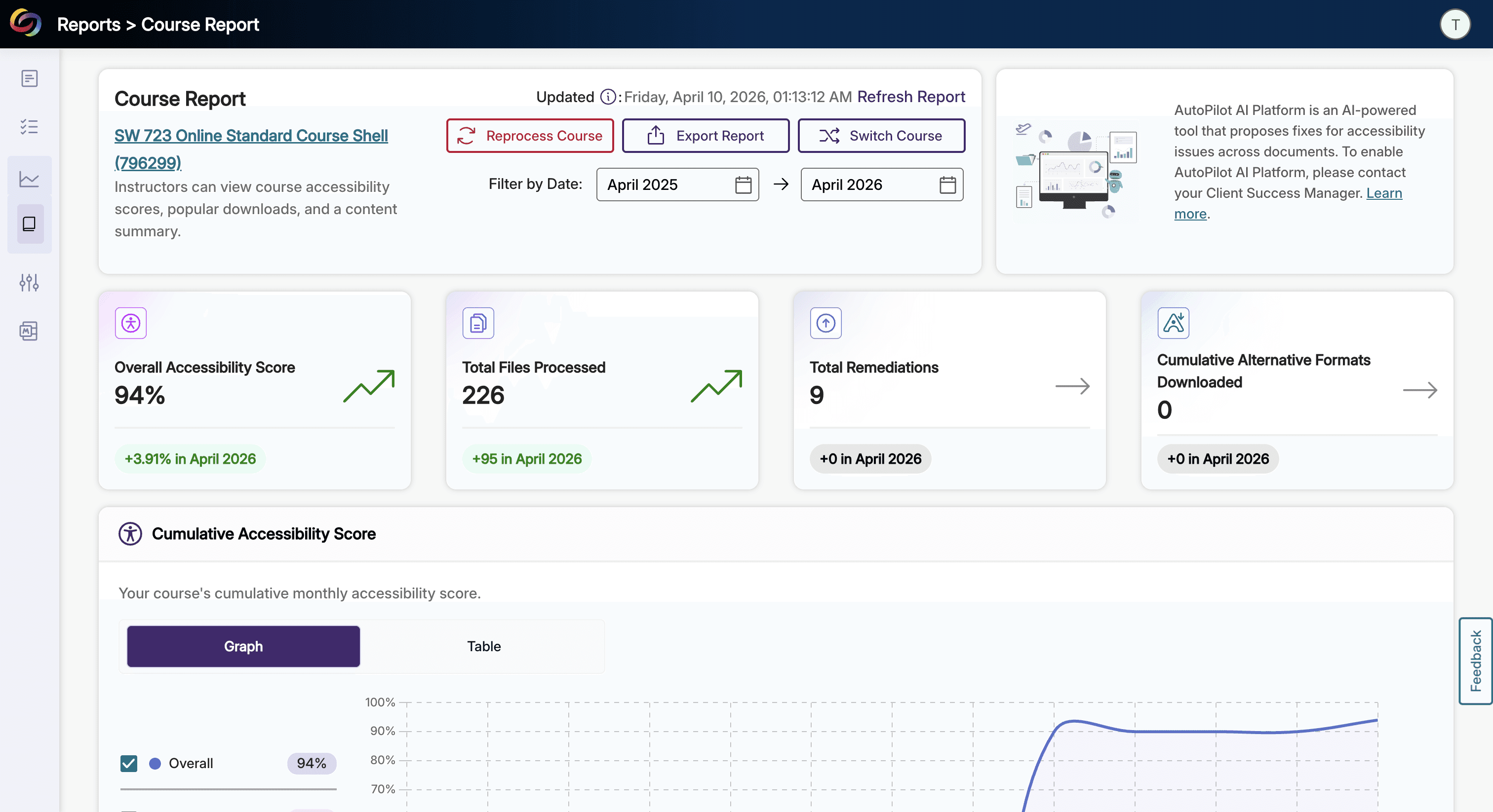
Panorama is the accessibility scanning website application used at the University of Michigan School of Social Work to remediate Canvas courses for WCAG and ADA compliance. Working there as a Digital Accessibility Student Assistant means using it every shift, and the same friction points show up every time: (1) no way to triage files without opening each one, (2) no built-in record of what changed or when, (3) and common actions that take four clicks when they should take one. These three improvements target those specific moments, not a full redesign, just the places where the interface consistently gets in the way.
Note: Some sections of the screenshots have been blurred to protect contents.
Original Workflow

Solution 1: My Modified List View w/ Updated Actions + Solution 2: Modal for Checking Duplicates

Justification for Changes 1 + 2
Solution 1: Modified List View
The list view is where every session starts, which makes it the most important surface to fix. The original gives every file the same visual weight regardless of severity, so prioritizing means opening each file one by one, checking the breakdown, and repeating that across however many files the course has. It's a slow loop for something that should take seconds. Users stop trusting tools that make simple orientation this tedious, and they start working around them instead.
Adding a color-coded Severity column and a Status column for published versus unpublished courses means the worst files are visible before you've started consciously looking. Red registers before you read the row. That's not a design preference, it's how vision actually works before language kicks in. When the interface reflects what you're trying to do, you spend less time figuring out where to start and more time doing the actual remediation.
Solution 2: Duplicate Detection Modal
Duplicate files are a trust problem before they're a usability one. When the same filename appears twice with no signal distinguishing them, you either investigate carefully every time or make a fast call without enough context. At the School of Social Work, where courses get reprocessed and unpublished shells get left behind, this happens often enough that it stops feeling like a quirk and starts feeling like something the tool should be handling.
The duplicate icon makes the problem visible before it becomes a mistake. It breaks the visual uniformity of the row just enough for your eye to catch it on the way past. The modal keeps it simple: here's the file, here are the copies, here are two choices that do what they say. Users stay engaged with tools that handle the investigative work for them, particularly in a part-time role where you're already splitting attention across multiple courses and faculty requests.
Modified Hover-Menu (in the Document View)

Solution 3: My Modified Hover-Menu (in the Document View) + Version History Feature

Justification for Change 3
Solution 3: Version History
Users using Panorama tend to work fast, and scan fast. As a result, the added icons for each label help for salience and quick scans during moments of confusion. This also helps newer users understand functions through pictorial context clues.
Documentation in the current workflow lives entirely outside Panorama. Every remediation gets logged manually: timestamps, Drive folder links, before-and-after notes written from memory when faculty or supervisors follow up. That's a significant amount of overhead sitting on top of the actual accessibility work, and it compounds across a semester. Tools that quietly generate extra admin work tend to get used minimally and resented consistently.
Version History moves that inside the tool. Updates get logged automatically with timestamps and scores, and the original file is always there to restore. That last part matters more than it sounds. Right now every update carries the implicit weight of being irreversible, which makes sessions feel higher-stakes than they should.